
This week I thought I would share a recent project I designed for a client. Keep in mind, I am involved with the design, pricing, ordering, receiving and installation of every detail. They don’t call it a “job” for nothing!
My client wanted to update and freshen up her living room, kitchen and breakfast room.
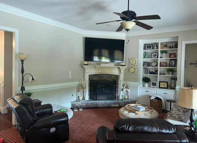
Let’s start with the living room, it was just a little too busy and dated. The La-zy Boy recliners were dark, worn and had a heavy look.
The fireplace needed more pop. The neutral color of the fireplace did nothing for the stone hearth. The book shelving was busy. My client wanted a change from the red custom rug and the floor lamp looked to me to be dated.
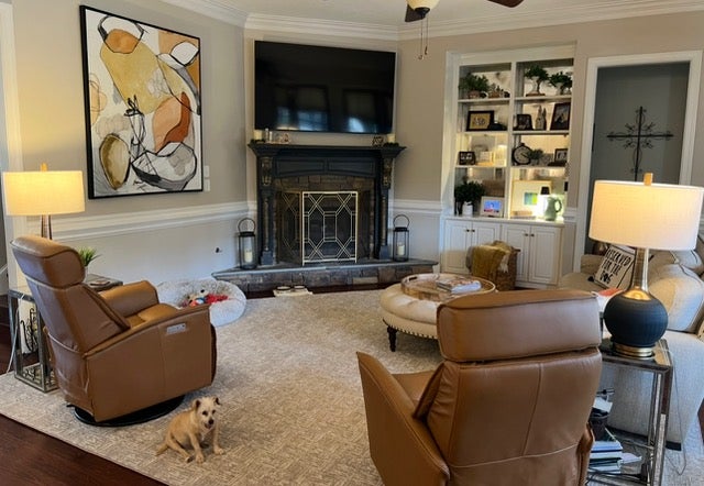
We needed something to create a theme, both in style and color. Something that would help pull the room together. We decided it should be the art. My client wanted a more modern look so we decided on an abstract.
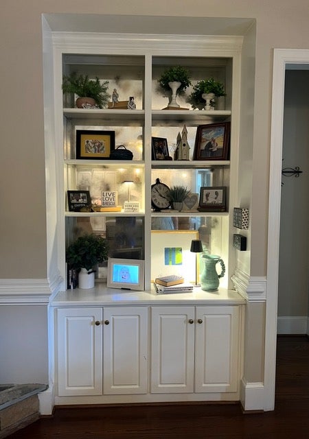
I found a piece that spoke to her. The faux painter I use, Suzanne Marks, added some black and gold detail on the fireplace. It gave it more impact and the coloring accented the stone hearth nicely. I got rid of a couple of shelves in the built-in, made and installed an antique mirror in the back and regrouped the decor on the shelves.

We found a great neutral carpet that was cut and bound as a rug. New end tables and large lamps ,as well as smaller scaled modern motorized reclining chairs. We reused the sofa and ottoman.
The window treatment was dark, busy and dated.
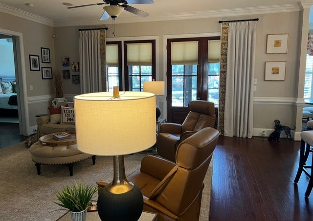
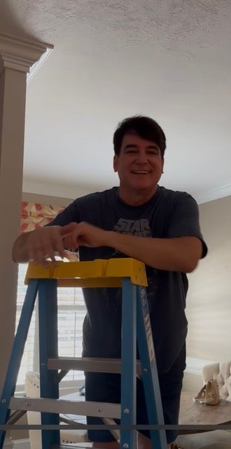
I reused the drapery hardware and made neutral panels and added a large gold drapery tape. A couple more pieces of abstract art completed the look Here I am installing the new drapery panels.
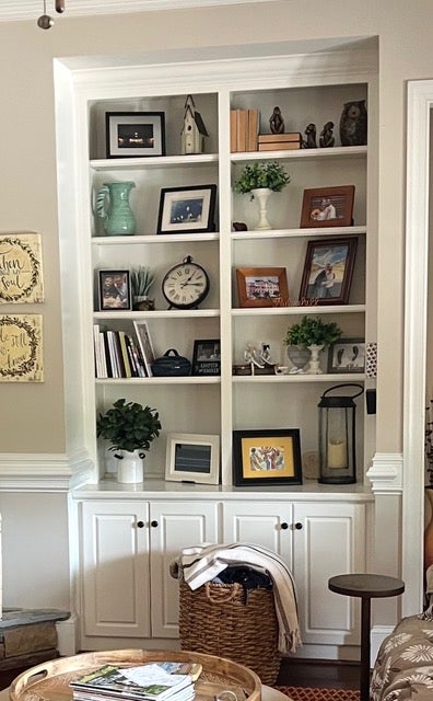
A closer look at the built-in book shelving before when it looked a little too cluttered.
Now it is minus a couple of shelves, has an antique mirror on the back wall and the decor has been regrouped.
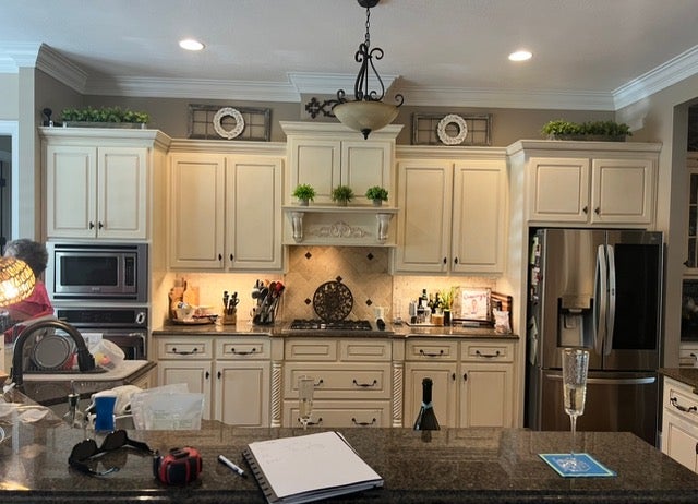
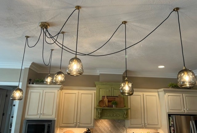
Looking into the kitchen it seemed a little flat. We needed to add some dimension and more interest. The central chandelier offered little light.
Wiring for pendants to hang over the island was not an option, so I found this great “spider” chandelier. It needed just one electrical box, yet allowed us the opportunity to swag and hang a series of pendants at our choice of length. The fixture had the more modern vibe my client desired.
Suzanne painted and distressed the island, cooktop cabinet and hood and cabinet above. It added some nice texture and helped create some pop in the kitchen. I played around with some cutting boards my client had and added a green color. The grouping made a nice statement.

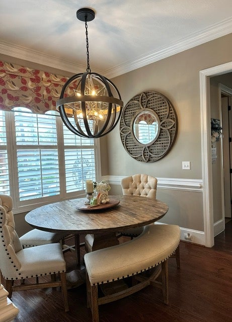
When looking into the breakfast room, the chandelier seemed dated and the wall needed something.
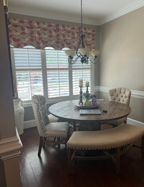
We decided to leave the window treatment. The round chandelier worked really well in the square space. Adding a mirror (another round element) reflected light and opened the space up.
My client was very happy and told me that my design “elevated’ her space. I like that word. I took her home to a new higher level than fit her desires.


