When I meet with many clients, I find that they thought they had gone out on a limb by selecting two colors to work with in a room and I am often asked what works with A or B. Never am I asked what works with both A and B.
Although I am glad people branch out to use more than one color in a room, I often find that adding a third color element can really elevate a room to the next level and make the package really look well put together.
It takes some thought and a bold spirit to bring in that third color. If you are starting a room from scratch, let me give you a few pointers:
Begin by selecting a decor detail that will be the most difficult to pair with other hues on the palette. That element would be either a rug, a piece of art or a fabric to be used on bedding, pillows or window treatment. This item should begin your motif in the room, not only with color, but also your pattern theme.
Eventually, you will want this item to pull everything together.
I find the best strategy is to involve the three colors you wish to work with right from the very beginning. I mention these three color combinations for a very important reason. You are most going to be limited by these ingredients, so when looking for a rug, you are looking for a specific shape and size.

If you decide to go round or square, you will find that you are even more limited. Art, as well, has to be of a certain size and shape as well as have the pattern theme and color scheme you want to use. Fabric, as well, has to bring in your color palette and pattern theme, should you choose a patterned material.
Imagine wanting an eight foot round rug in colors of gray, pale blue and Peach. This is where you will be most limited, so start there first.
If you want to begin with your art, then start by considering your theme. Do you want a more traditional, contemporary or transitional theme? What size? What are the three predominant colors? And what about the size and shape of the frame? Again, this could be a limited consideration, but it makes for the perfect starting point.

I recommend pillows and window treatments to not be so heavy with a bold pattern, but sometimes that is just what the doctor ordered to begin your color scheme and theme!
Once the most difficult elements are worked out, everything else will come a lot easier. You will want your floors and walls to be neutral, unless you want a pop of color that you would pull from your theme items.
Decor such as lamps, sculptures, books, candles and floral are fun aspects to consider once you have your main pieces chosen. One of the three colors should have lesser amounts of items. You want it to pop and not be as strong as the other two colors, so use that color sparingly.

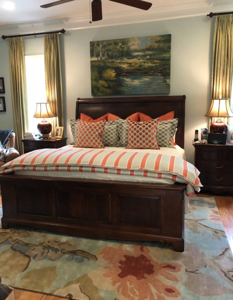
Take a look at this bedroom. The rug has a blue, a green and then a pop of coral. Most everything else in the room is blue or green, but by adding a few pops of the coral on the bed pillows, it really gives it some visual interest and adds depth!
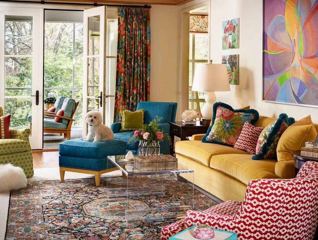
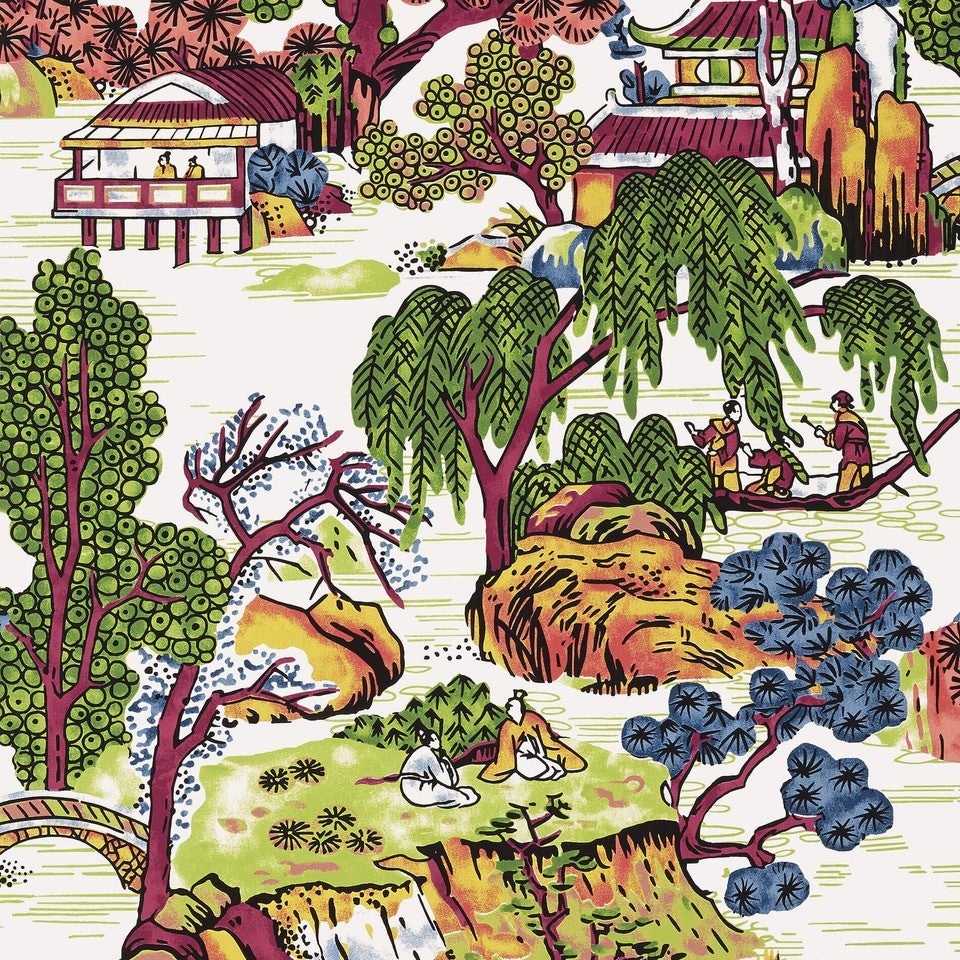
Gold, red and blue. The art began this process!
Notice, in the above shot, how the wood structure of the ottoman meshes nicely with the couch, pillows and wall art, but doesn’t overpower the area rug. Remember, the only thing holding you back is your own imagination!